Modern Doing: the genesis & branding
Hi friends! I’m excited to share the latest issue of Desk Lunch, a newsletter for creatives of marginalized genders, written by yours truly. 👋 In it you can read about my lifelong obsession with what to do in life and how that led to the idea for Modern Doing.

If the piece resonates with you in any way, please reply and share :) I love hearing from you all and this topic is forever fascinating to me.
Today I’d like to dive into building a brand for Modern Doing. After deciding to start an online magazine/interview series about work and meaning last summer, I signed up for a Branding class with Designlab.
After graduating and starting full-time work, I realized maybe I really did love school: the finite amount of work on a variety of topics with clear feedback and expectations. I have loved taking classes since then, so signing up for this class was a no brainer. I wanted to define the look and feel of Modern Doing myself but didn’t have brand design experience, so I knew the weekly check-ins with my mentor Peter would help.
What is the brand?
The first week of the course was all about clarifying what the company or project was. What is its name? What are the connotations behind it? What were the reasons for this name?
I landed on “Modern Doing” as the name for this project while walking around the city (walking is the best for brainstorming). There are still some days I am embarrassed by the name—it sounds like a furniture brand, it could be terrible to optimize for SEO. But overall it makes sense since I want this project to explore what "doing" means in our current landscape, considering how much keeps evolving with each generation.
After the name, I was tasked with writing a marketing strategy and creative brief. The marketing strategy made my head explode thinking about target market, positioning, and pricing/sales. I didn’t know if I wanted to pursue the ideas I was writing down (selling small group workshops and courses, coaching, adding advertisements) since it wasn’t my intention to create Modern Doing to be a business.
It didn’t end up mattering too much, though, since the creative brief is the real meat and potatoes for developing a brand. Here’s the one I wrote after discussions with Peter:

Logo
Making a logo is HARD. Peter really pushed me to create a logomark (e.g. the swoosh of Nike) as opposed to just a wordmark. We talked about how lots of millennial brands look the same nowadays (see: “Why Does Every Lifestyle Startup Look the Same?”)
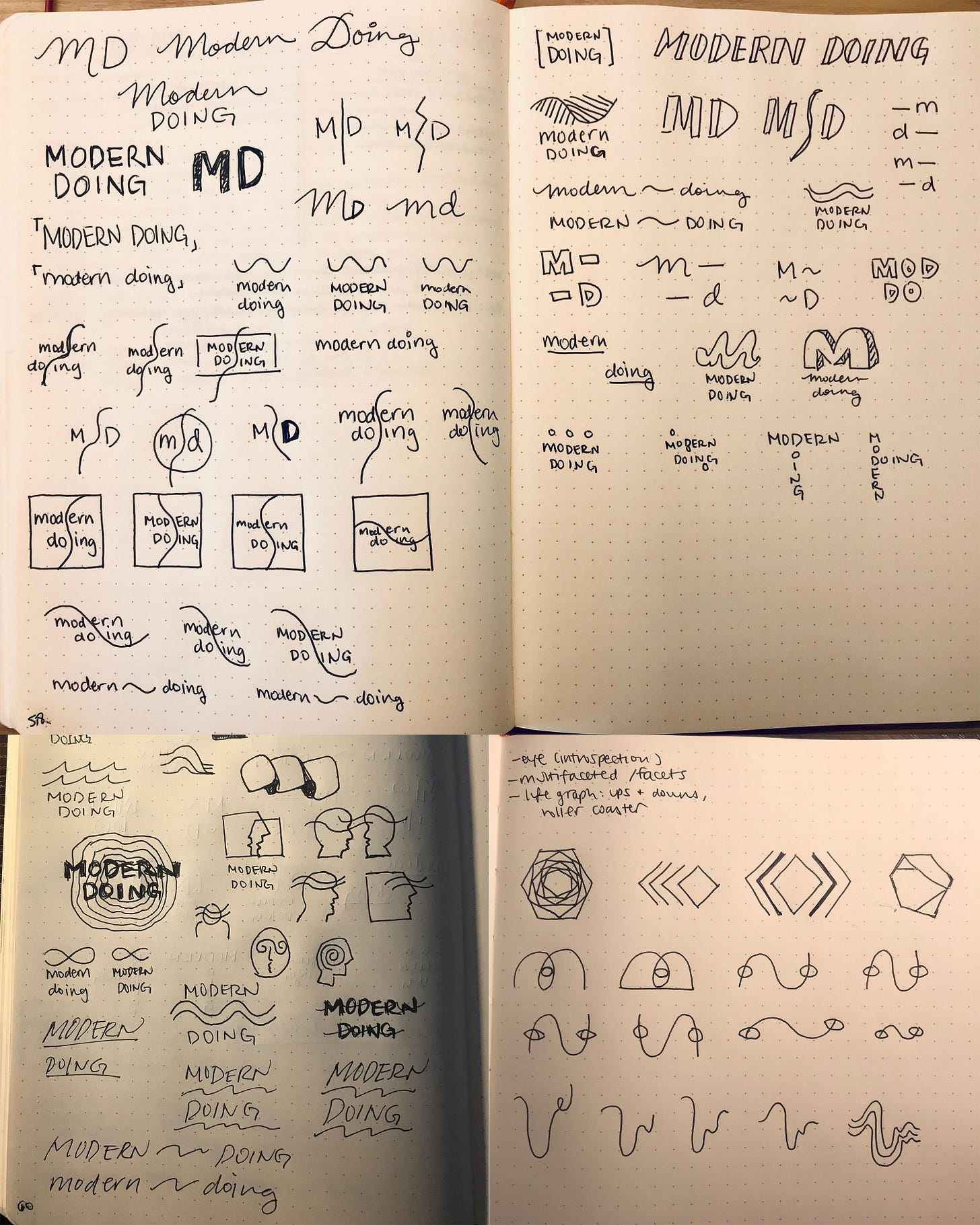
Below are my logo sketches (first time attempting to create a logo please keep in mind!!) I thought of a wave motif to represent how doing is constantly in flux for the first round (top). Peter wrote back:
“Alone the wave might be enough as a representation of flux, but closing in to a square or a circle somehow doesn't fit right from the sketches, as these shapes are "blocking" the flow. It feels like there is a beginning and an end, meanwhile this is a continuous journey.”

For the second iteration (left), I kept exploring waves along with face outlines or infinity symbols. Peter told me to keep trying new ideas, saying “You really like the waves don't you huh? :)” Level of despair inside: 💯
Before my last iteration (right), Peter suggested I look at Logo Modernism, which had a crazy amount of beautiful, timeless logomarks. I focused on the wave (riding that to my deathbed), an eye for introspection and self-discovery, and embedded hexagons to represent many ways of doing.
Choosing type was an easier process. After a few explorations, we landed on Karla for its balance and friendliness.

Finally, time to refine the sketch digitally. I used one of the sketches from the third iteration. My sister had the great idea of intersecting the mark with the o’s in the name, so that the o’s represented different points in one’s winding path. I loved this suggestion and felt more confident that this was the right choice.

Colors
Now for the fun part: colors! I thought of the brand tone from the creative brief and chose muted colors to connote a calm friendliness.

Peter suggested I check color contrast for accessibility (I should have known this as a web developer 😞And yes, the choices above failed to pass) and that the "o" characters could be filled in instead of intersecting.
Filling in the o’s looked clunky, so I cleared the space within the o’s, making for a cleaner logo and wordmark! We landed on the blue and cream colors in the first option you see below.
Blue is an entire mood—one that is slow to grow but spreads with a measured pace and encompasses everything it touches…blue signifies a struggle, and one that is usually necessary on the path to enlightenment. —Allure
Really, what could be a better color for this project!

The last step was gathering all of the elements above into a brand manual for reference. Thinking about the brand design extensively and having the manual has been a godsend.
Not only was the class a great way to solidify the idea for my project, but I could also assign meaning to the visual beyond the aesthetic. Perhaps it’s not be the most groundbreaking design, but I’m really proud of what I could create on my own and I know that the brand will evolve as the project continues to grow.


