A few weeks ago I drew an editorial illustration for the stellar Substack publication
, and I would love to share the process with you today!I first worked with Anne a few months ago on a fun illustration on parenting advice from childfree New Yorkers (we discovered each other through Substack Notes!) Anne reached out to me again over email to illustrate a new feature called “Department of Personal Experimentation.”
Here’s what she wanted from the image:
A depiction of Anne (wearing all black) conveying the idea of different kinds of personal experiments
Lighthearted and cheerful in tone
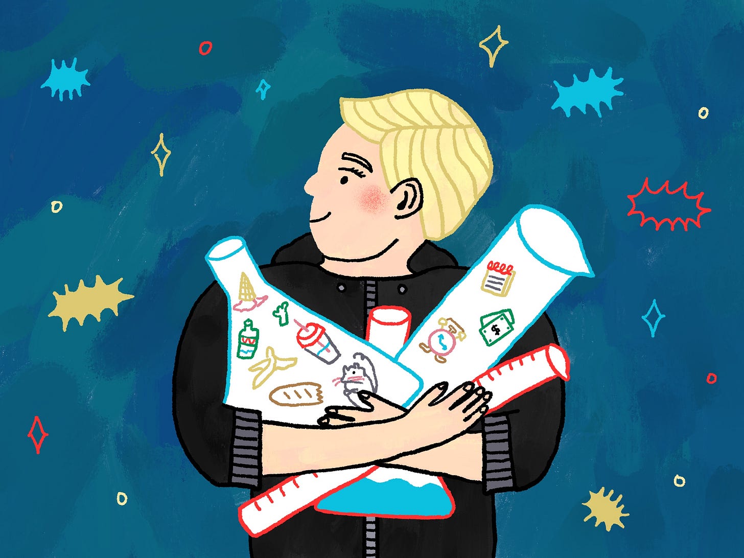
Feature newsletter colors of red and turquoise if possible
Anne also sent over an early draft of her newsletter where she mentioned some past and current personal experiments, which was hugely helpful to spark inspiration! In it she mentions previously eating only food found in the trash and giving exactly one dollar to everyone who asks for money. These were the experiments I focused on as I ideated sketches.
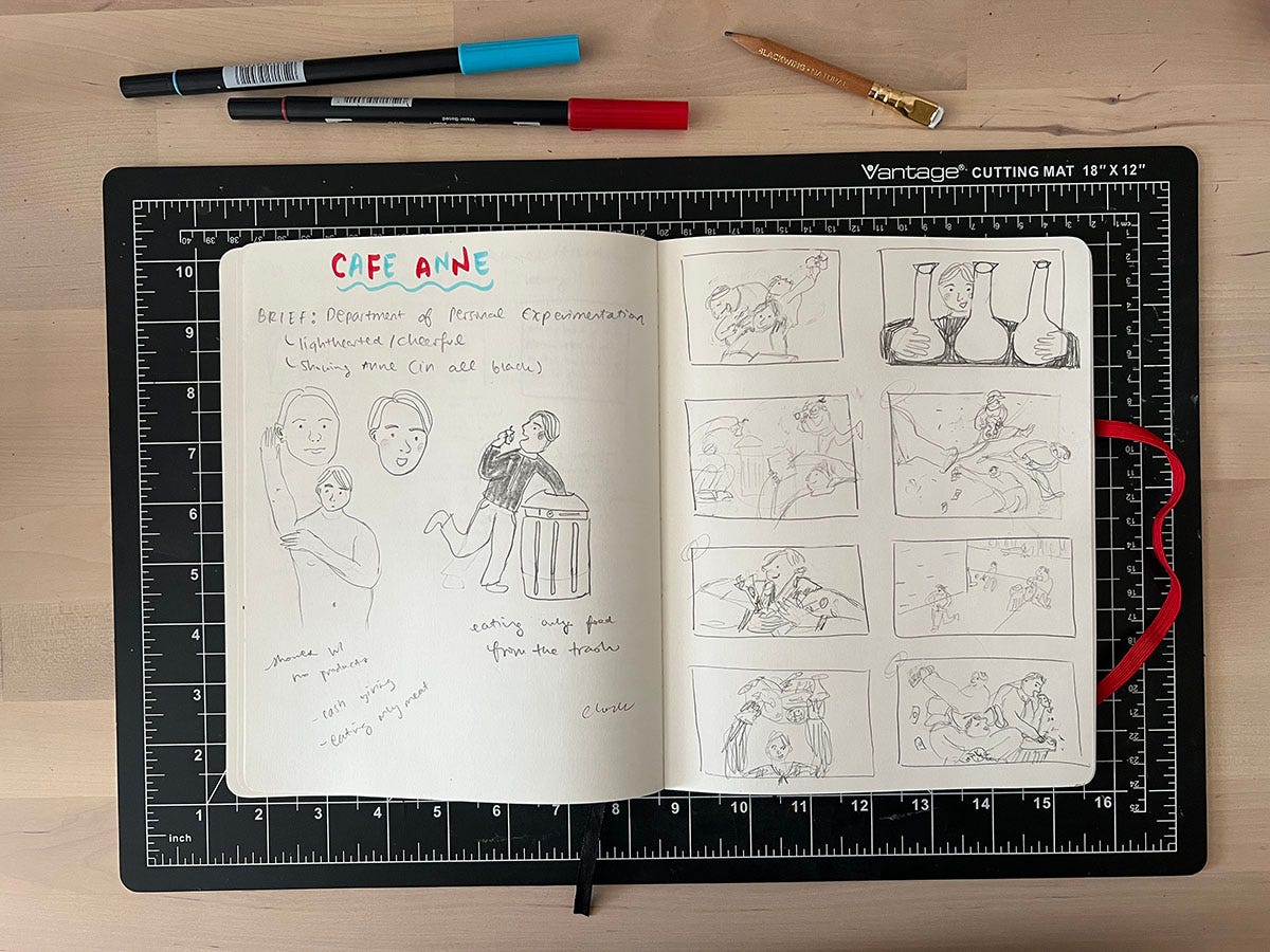
I took some notes in my sketchbook then worked on a page of thumbnails. Generation is the key here, and it’s important to not get too carried away and fall in love with one thumbnail from the start. I find it helpful to draw numerous boxes for thumbnails that will force me to keep coming up with ideas, no matter how bad.
I will usually present the client with 2-3 sketches, from which they will pick one to move onto the final stage. Since this illustration had a quick turnaround, I proceeded with refining sketches for two of the thumbnails in Procreate.
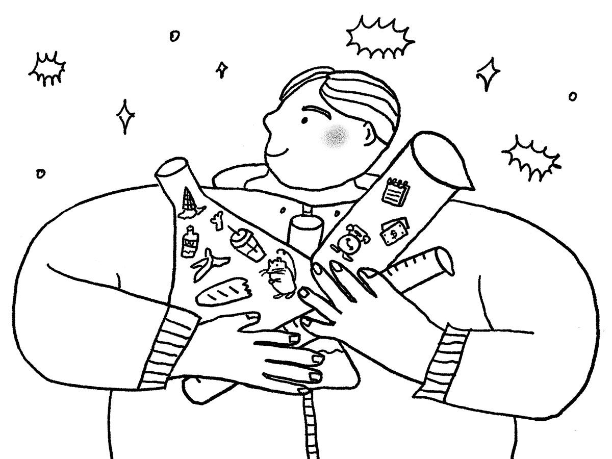
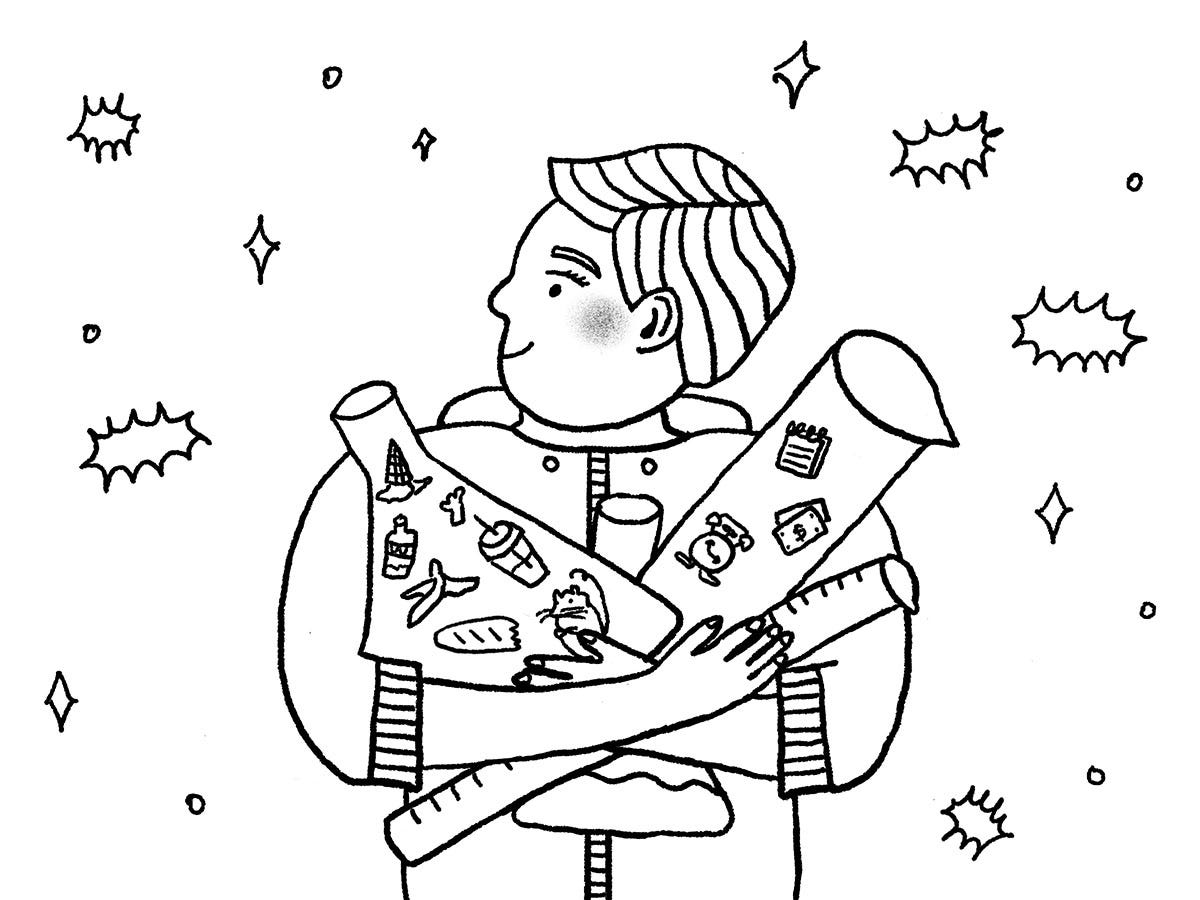
Sketch 1 shows Anne holding lab equipment such as beakers and test tubes for her experiments, with icons inside to represent past studies (trash! cash! NYC rats!)
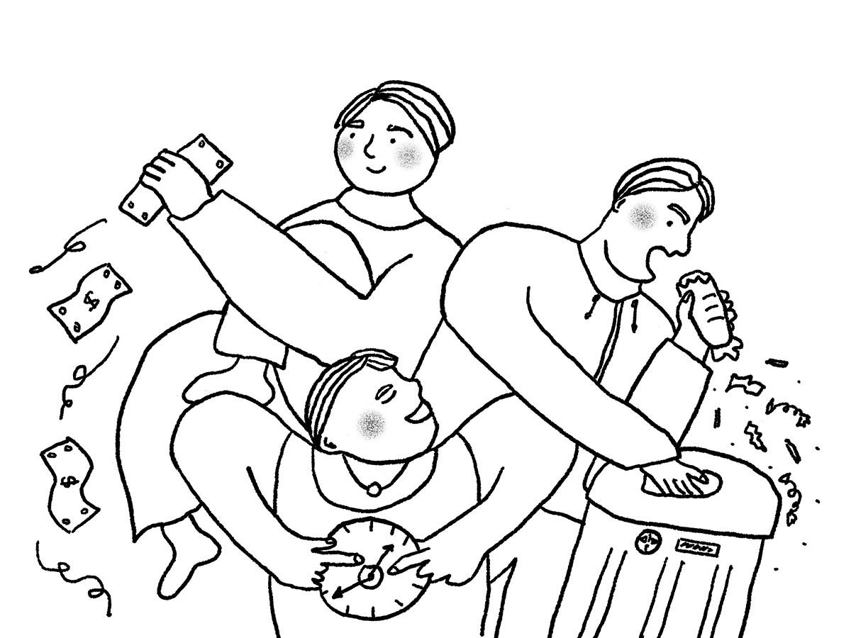
Sketch 2 shows several versions of Anne conducting her personal experiments. I really love how much activity is going on in this one, like all the innards flying out of the half-eaten sandwich!
It’s common for an illustrator’s favorite sketch to not be the one that’s picked by the client, and that was the case here. Anne wanted to go with option 1, and she requested that the character be more representative of her (such as her pixie cut hairstyle) and that the body not be supersized. I liked how the body in this first version fills up the frame, but completely understand Anne wanting the character to feel true to her! So on to round two…
This was the revised sketch with added eyelashes and changed hairstyle. I scaled down the body and added flourishes to the background to fill the space. I was hesitant to shrink the body too much since the items inside the lab equipment the character is holding still needed to be visible.
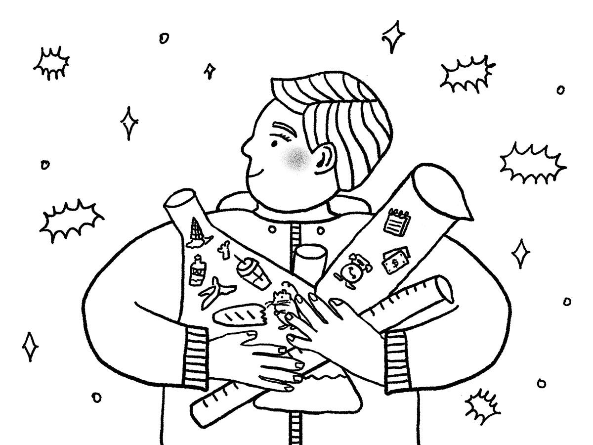
Anne still felt that the body didn’t feel representative of her, so the sketch needed more shaking up!
Third time’s the charm: by bringing the arms in close to the body, I was able to make the character a more representative size while staying true to proportion. Anne signed off on this revision and I was off to work on the final illustration.
And here’s the final illustration, fully made in Procreate! I’m really pleased with the textured background which is how I like to work in gouache, and how I used the required bold red and turquoise colors and balanced them with more neutral golds and blues. You can see the image in context in CAFÉ ANNE’s newsletter below.
Which was your favorite sketch version? What do you think of the final result?
If there’s one thing to take away from this, it’s that illustrators put in a lot of work for artwork that most people look at very briefly. Take some time to really see the illustrations that are paired with the articles and books you read, and you’ll gain a whole lot of perspective and appreciate a different form of storytelling.
I’ll end with my favorite Substack post of the week, which is
’s truly epic process post of her debut author/illustrator picture book, Oh, Olive! It shows all the hidden work that an illustrator does, like this editorial illustration process x1000000. Please check out the post and her new book now out in stores!



Carolyn it was so fun to read about what it was like on your end of things! And fascinating to learn that you so strongly preferred the other option. I know the feeling!
In any case I LOVE the end result, as you know. I'll be running it again in a couple weeks!
I definitely liked the second illo too! Why do clients never choose the ones we love :(((